
WHY WE NEED DIVERSITY IN OUR DESIGN TEAMS: BOSSES, BREASTS & BS.
- Dr Francesca Maclean

- Mar 18, 2019
- 3 min read
Updated: Oct 20, 2024
Last year, I had to develop a non-academic and non-industry CV for a leadership program application. Taking all that I had read on CVs that are engaging and belonged in 2018, I set out to make a spiffy CV with icons that added a little bit of character.

However, I couldn’t ignore the bias that was so evident in my search for suitable icons. For my employment section, I wanted to get an icon of a business woman (spoiler alter: I settled for a ‘notebook’ icon).
Using ‘the largest database of free icons’, searching for ‘business woman’ returned 512 results, with ‘business man’ returning 1,343 results. Hmmm.
Nevertheless, I downloaded a pack of business icons, where I came across an icon showing me what a boss looked like – lest I think it be someone like me: a man with grey hair. And I also found a female user, wearing a low-cut top and an emphasis on their breasts – I can only assume it is the designer’s attempted clear (and exclusionary) identification of what it means to be female.

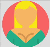

Figure 1: Three icon images of people. A grey-haired man in a suit is labelled ‘boss’, a woman icon is a blonde woman in a green top with cleavage showing, and the third icon shows a man in a navy shirt.
So of course, I ended up down the rabbit hole of suggested icons and found myself looking at a ‘professions’ pack (shown below). Out of the 46 that had ‘identifying’ features of being a man or woman, only 12 were women (26%), and were represented in the stereotypical roles assigned to women (nurse, flight attendant etc.) rather than the positions where elitism and prestige seems to be reserved for men (surgeon, pilot etc.).

This may seem like a trivial issue; however, I have spent years trying to find graphics and icons for presentations that are representative of my gender – and I am generally left wanting. I have to actively search for unbiased, non-stereotypical representation of women in STEM, or the general workforce. With women making up 46.9% of Australia’s workforce according to the Workplace Gender Equality Agency, it is reasonable to expect equal and respectful representation of women in graphics – and extend that to movies, TV shows, and any other realm, really.
The need for diverse designers, teams, and perspectives is clear – in most teams we are producing something, whether it be a product, design, or even a report. Someone interacts with what we produce, and without knowing, we communicate a lot. I have worked in teams where a man in a suit is used to represent ‘investment’, and where our graphics teams had to re-release our infographics which previously contained predominantly male representation in the figures. This is not uncommon. Facebook underwent a re-design when Caitlin Winner, Design Manager, noticed that the ‘friends’ icon was a woman behind a man: redesigning them to be on the same level is a small change, but one that reaches millions each day as they use Facebook.

We saw Apple respond to criticism of their biased (white, hetero) emojis by developing skin-tone modified people, adding in same-sex family emojis and providing women with more options for representation other than being a bride (now we can be scientists and astronauts too – but are still segregated into women wearing pink and men wearing blue. Baby steps I guess?). With Apple being criticised for one-dimensional representation of race (skin tone), and other examples of biased software such as Google Photo’s facial recognition categorising black people as gorillas in 2015, this demonstrates the clear need for diversity in design teams and the need for conscious inclusion.

While some might consider icons, graphics, and emojis subtle or low-impact messaging, they continue to reinforce gender stereotypes and gender segregation in the workforce, and the under- or misrepresentation of racial groups that may differ from those who design them.
We can start to change this messaging and the underlying bias if we change what and how we communicate. Within this seemingly incidental messaging, we can change the story – and if you are in a design team, or lead one, have a think about how diverse your team is, and whether you are designing for everyone, or just some.


Comments